AICE Media Studies Hair
Sunday, March 27, 2022
Tuesday, March 22, 2022
Tuesday, March 15, 2022
Model Recruiting
I have decided to start taking pictures for my magazine this Sunday. I chose Sunday because I know most of my friends will be free and I will have the whole week after that to edit them into my magazine. I will selecting 6 guys to cut their hair. I will be doing this for free as they're generously taking the time to help me during the photoshoots.
After some research in different poses I can take these pictures, I was fond of having the barber also in the photo. In order to get these pictures i will need someone to take them for me. I will be bringing my girlfriend, since she has an eye for knowing what looks good and doesn't. I'd rather have her take the photos of me than one of the guys who will not know I do and don't like.
The 6 guys i've chosen are Juan Castro, Issac Liebman, Ryan Ugalde, Nick Zilka, Noah Fernandez and Matthew Gordon. I am familiar and have cut all these guys hairs before multiple times so I'm not even worried about getting the outcome I want. I really want diversity in my magazine to target an audience of men throughout all cultures. To do this I selected a diverse group of guys who are white, hispanic and black. This will also be a great way to incorporate my double page spread of different hair textures. I reached out to all the guys to see if they were available on Sunday.
Here are all of the pictures of the haircuts I incorporated for this magazine:
Change in Color Scheme
In the survey I made and sent out to my family and friends earlier in the year, I got feedback that gave me the impression that Black and Gold was the best option. I too thought this would look the best and give a nice clean feel. After testing out the colors I came to the realization black and gold was not what I wanted the color scheme of my magazine to be. The colors cheapened the look of the magazine and it didn't fit what I wanted to give off. In a way this magazine is a representation of me and if I don't feel like the two colors matched my style, I wasn't going to hesitate to change it. I want this magazine to be something i'm proud of sharing and posting to gain publicity.
Creating my layouts
I've stared to design my layout for my magazine. Im using Canva because it seems to be the easiest way to be artistic. When exploring Canva I realized I can get very creative when making my magazine. I noticed in basic magazines they usually have all the same simple designs. With Canva i'm able to create anything I want following a color scheme. I used Canvas templates to create inspiration in my mind. I saw that I was able to add stickers, so I found a sticker of scissors and a comb that seems to fit my theme very well. Im thinking of having this be my logo for the magazine.
The process at first was very overwhelming because I didn't know where to start. I decided to add all the pages I needed for the magazine. I needed the cover (1 page), table of contents (2 pages), Ad (1page), and Double page spread (2 pages). I added all 6 pages and titles all of them what was supposed to be what. After that I tested out my gold and black theme. I made the background black and made my titles gold. When seeing it made I knew it could've been better so i kept looking. That's when i found my brown, white and black color theme. It seemed a lot more classier and fit my vibe as a person. I want this magazine to represent me and be something i'm proud of. So, if that means changing some things I had planned then so be it.I then created what I wanted on each page. On the front cover I know I want a main photo to take up the whole page. For now, i'm using past pictures of haircuts i've taken within the week as placeholders. This helps me build where i want my content to go.
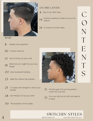
On the front cover I added 3 subheading to grab the readers attention. The one on the right says, "10 unique summer styles" and the one on the left says "Upcoming products for flawless hair". Under the subheading on the left I added a comment that reads "See what products are made for your hair texture inside!". This is the topic i've decided to discuss in my double page spread and thought it would be fitting to add it to the cover.
Sunday, March 13, 2022
Location Backup
When it comes to relying on a place to use, things may not turn out the way as expected. If so, the location I would use as a backup would be my patio barbershop. In my patio I have a barber chair, tools/machines, LED lights, cape, and many more things that a barbershop has. Down below, would be an example of how my pictures of my haircuts would be like if this location would be used. Barberxlife Barbershop is a very reliable location for my magazine, but just to be safe I have an alternative area for similar results. The camera utilized for these pictures is by the Iphone 13, using portrait mode after the product. The lighting has the same effect it would have if I was in the barbershop, instead of multiple light sticks I installed 3 LED lights to a fan outside in order to see haircuts better and make pictures better. Since I've had many haircuts at my patio, I contain many pictures of haircuts in the past which I can use for my magazine
Thursday, March 10, 2022
Table of Contents
Since I am making a hair magazine that is directed towards men, I will include topics that relate with styles, hair care, different types of hair and products. Mostly all of my product and model pictures will be taken at the barber shop, using professional lighting. I will have the pages title say "contents" in bold gold font, with "switchinstyles" above it. The below magazine, Elle, is a great inspiration on how i want my table of contents to look like.

Location Scouting
As you can see in the image above, this is an idea of how images would come out in the barbershop when getting a haircut. The prime purpose of the magazine isn't to promote the barbershop, I'm using the area to photoshoot and cut hair, which my connections to the owner to allow me to do this freely.
Wednesday, March 9, 2022
Editorial Pillars Options
Editorial pillars reflect your audiences needs as they relate to your magazine. These are a set of content subjects or topics that fit both reflect your brand and sit perfectly in the space you seek to occupy in your users’ minds. For example, if you are retailing high end watches and jewelry you may want to focus on editorial pillars of luxury lifestyle, exclusive real estate, first class travel and fine dining. I had a bunch of ideas on what I wanted my magazine information to consist of. I narrowed it down to four options, which I then added in my Hair Magazine Survey. The four options were interview with the hair stylist, photoshoots, tutorial on a particular hair texture and style, Development of Hairstyles over time.
For interview with the hair stylist I thought that it could be the most easy for me to write about since it's my personal experiences. I could discuss the process of how I cut a hairstyle showed in a picture, the story of how I got into cutting hair or what hairstyle fits the reader the best. There was a lot of ways I can go with having my own pillar. This can benefit the reader weather they're looking for a new style or want to get into the craft of cutting hair.
With a photoshoot pillar I could discuss how I set up to take my pictures. Photoshoots incorporate a lot of set up time. You need to consider the right lighting, angles and tone of colors. This was definitely something I would read about and anyone else who is interested behind the process of getting cool photos. Although, i'm not too sure it would be best for the audience who is just interested in haircut styles.
Tutorial on particular hair types can be very interesting for any audience. I could go in depth about the different products and hair care you should be using for your specific hair types. The only problem with this is I might leave a hair type out and if I have too many hair types I wont be able to go into depth for each one without making it too long and not visually pleasing to the reader.
Development of hairstyles is very interesting and matches with the my brand of the magazine. I can make it visually appealing with pictures and a timeline. The only issue is all the pictures would have to come from me which will be very hard since I need to replicate old hairstyles.
The results of the survey was.... 39.1% for


